直方图常用于表现数值型数据的分布特征。其外观跟柱状图和条形图类似,都是用矩形面或长方体表示数据。但是二者有本质的区别。首先,从外观上看,直方图的矩形面或长方体之间没有间隔;其次,图形所表示的数据有完全不同的意义。直方图的常见类型有一元直方图和二元直方图。[大谦Excel,dqexcel点com]
一元直方图的绘制方法
直方图是将数据从小到大排序后在最小值和最大值之间等间隔进行分箱,然后统计原始数据落在各分箱中的个数或其他统计量,并根据个数或其他统计量的大小绘制相应长度的矩形面。所以,直方图是统计中频数分析结果的图形表示。可以根据各分箱中的数据绘图,如图4-1根据各分箱中的数据个数绘直方图,用条形的长度表示数据个数的大小。

图4-1 一元数据的散点图和直方图
实现图4-1的Python xlwings代码为:完整代码见:Samples->ch07 数值型图表->01 直方图的绘制方法->py.py。
#... 省略部分代码
root=os.getcwd()    #获取当前工作路径
app=xw.App(visible=True,add_book=False)    #创建Excel应用
app.ScreenUpdating=False
wb=app.books.open(root+r'/data.xlsx',read_only=False)    #打开数据文件返回工作簿对象
sht=wb.sheets('Sheet1')    #获取指定工作表对象
shp=sht.api.Shapes.AddChart2()    #创建空白图表
shp.Left=20
cht=shp.Chart    #获取图表
cht.ChartType=xw.constants.ChartType.xlXYScatter    #图表类型为散点图
ax1=cht.Axes(1)    #获取横轴
ax2=cht.Axes(2)    #获取纵轴
ax1.MinimumScale=0    #横轴最小值
ax1.MaximumScale=81
ax2.MinimumScale=0    #纵轴最小值
ax2.MaximumScale=0.35
y=sht.range('A2:A41').value    #获取数据
x=range(40)
cht.SeriesCollection().NewSeries()    #新建序列,绘制散点
cht.SeriesCollection(1).XValues=x    #横轴数据
cht.SeriesCollection(1).Values=y    #纵轴数据
ax1.Delete()    #删除横轴
ax2.HasMajorGridlines=False    #不显示纵轴主网格线
cht.ChartArea.Format.Line.Visible=False    #隐藏图表区外框

#计算统计量
minv=app.api.WorksheetFunction.Min(y)    #最小值
maxv=app.api.WorksheetFunction.Max(y)    #最大值
rng=maxv-minv    #极差
step=rng/5    #增量
xi=[0 for _ in range(6)]    #初始化
count=[0 for _ in range(5)]
xi[0]=minv
#计算分箱边界值,初始化各分箱数据个数为0
for i in range(5):
    xi[i+1]=xi[i]+step    #分界处的横坐标
    count[i]=0    #分箱中数据个数
#频数统计,每个分箱中的数据个数
for i in range(39):
    for j in range(5):
      if y[i]>=xi[j] and y[i]<xi[j+1]:
          count[j]+=1
count[4]+=1
#画横线和标注
accu=0
for i in range(6):
    accu=minv+step*i
    draw_line(cht,0,accu,55,accu,2)    #绘制分箱界线
accu=0
for i in range(5):
    accu=minv+step*(i+1)
    draw_rect(cht,55,accu,count[i],step,str(count[i]))    #用频数绘制直方图
#绘制外框
draw_line(cht,0,0,0,0.35,1)
draw_line(cht,41,0,41,0.35,1)
draw_line(cht,0,0,41,0,1)
draw_line(cht,0,0.35,41,0.35,1)
绘制一元直方图
Excel提供了绘制一元直方图的方法,也可以用VBA或Python通过编程进行绘制。

图4-4 用自定义函数生成的一元直方图
自己绘制直方图,首先需要将数据升序排列,将数据等间隔分成若干区间(称为分箱),然后遍历数据,统计数据落在各区间的个数,最后利用这个个数绘制零间隔的柱状图。完整代码见:Samples->ch07 数值型图表->02 一元直方图->py.py。
def draw_hist(sht,n):
#频数分析
x=sht.range('A1:A1000').value #获取数据
xi=[0 for _ in range(11)]
xi2=[0 for _ in range(10)]
count=[0 for _ in range(10)]
bx=10
minx=9999
maxx=-9999
#求最小值和最大值
for i in range(n):
if minx>x[i]:
minx=x[i]
if maxx<x[i]:
maxx=x[i]
difx=maxx-minx #极差
stepx=difx/bx #增量
#初始化各分箱中的数据个数
for i in range(10):
count[i]=0
xi[0]=minx
xi2[0]=minx+stepx/2
#计算各分箱的界线值
for i in range(1,11):
xi[i]=xi[i-1]+stepx
if i!=10:
xi2[i]=xi[i]+stepx/2
#统计各分箱中的数据个数
for i in range(n):
for j in range(10):
if x[i]>=xi[j] and x[i]<xi[j+1]:
count[j]+=1
#根据频数绘制直方图
sht.api.Range('D3').Select()
shp=sht.api.Shapes.AddChart2() #创建空白图表
shp.Left=20
cht=shp.Chart #获取图表
#清空序列
for i in range(cht.SeriesCollection().Count,0,-1):
cht.SeriesCollection(i).Delete()
cht.SeriesCollection().NewSeries() #新建序列
cht.SeriesCollection(1).ChartType=xw.constants.ChartType.xlColumnClustered #柱状图
cht.SeriesCollection(1).XValues=xi2 #绑定序列数据
cht.SeriesCollection(1).Values=count
cht.ChartGroups(1).GapWidth=0 #柱面之间没有间隔
#设置柱面的属性
fl=cht.SeriesCollection(1).Format.Fill
fl.ForeColor.ObjectThemeColor=5 #msoThemeColorAccent1
fl.ForeColor.Brightness=0
fl.Solid()
#边线的属性
ln=cht.SeriesCollection(1).Format.Line
ln.Visible=True
ln.ForeColor.ObjectThemeColor=13 #msoThemeColorText1
ln.ForeColor.Brightness=0.05
return cht
root=os.getcwd() #获取当前工作路径
app=xw.App(visible=True,add_book=False) #创建Excel应用
wb=app.books.open(root+r'/data.xlsx',read_only=False) #打开数据文件返回工作簿对象
sht=wb.sheets('Sheet1') #获取指定工作表对象
cht=draw_hist(sht,1000) #绘制直方图
set_style(cht) #设置样式运行完整代码生成图4-4所示的直方图。注意,代码中用柱状图根据各区间频数绘制直方图,将柱形面之间的间隔设置为0,显示柱形面的边线。将区间分界值作为横轴的刻度标签,数值保留2位小数。
二元直方图的绘制方法
二元直方图是一元直方图的扩展,根据两个数值型变量的数据绘图。二元直方图中,分箱位于两个变量升序数据分区后对应区间的交叉处,落在分箱中的数据个数或其他统计量的大小由两个变量共同决定。图4-5所示Excel工作表中,A列和B列给出了用于绘图的两个变量的数据。

图4-5 二元数据
将两个变量的数据分别进行升序排列,并等间隔分成N个区间,比如10个区间。将两个变量分别定义X轴和Y轴,如图4-5中所示,得到一个10行10列的网格,共100个分箱。遍历排序前的原始数据,每行数据中的第一个作为x值,第二个作为y值,判断它落在哪个分箱,该分箱的数据个数加1。遍历完后,得到每个分箱中的数据个数,如图4-6中所示。

图4-6 对二元数据进行排序、分箱和频数分析
最后根据各分箱中的数据个数绘制二元直方图。用柱体的长度表示数据个数的大小,如图4-7所示。

图4-7 利用频数绘制二元直方图
绘制二元直方图
4.1.3小节介绍了绘制二元直方图的方法,下面介绍绘制二元直方图的具体操作。
用Python xlwings编程生成二元直方图,首先需要按照4.1.3小节介绍的方法对二元数据进行分箱和频数分析,最后利用频数绘制零间隔的三维柱状图。完整代码见:Samples->ch07 数值型图表->03 二元直方图->py.py。
root=os.getcwd()    #获取当前工作路径
app=xw.App(visible=True,add_book=False)    #创建Excel应用
wb=app.books.open(root+r'/data.xlsx',read_only=False)    #打开数据文件返回工作簿对象
sht=wb.sheets('Sheet1')    #获取指定工作表对象
x=sht.range('A1:A1000').value    #获取数据
y=sht.range('B1:B1000').value
#频数分析
bx=10
by=10
minx=9999
maxx=-9999
miny=9999
maxy=-9999
#计算两个方向上的最小值和最大值
for i in range(1000):
    if minx>x[i]: minx=x[i]
    if maxx<x[i]: maxx=x[i]
    if miny>y[i]: miny=y[i]
    if maxy<y[i]: maxy=y[i]
difx=maxx-minx    #x极差
dify=maxy-miny    #y极差
stepx=difx/bx    #x增量
stepy=dify/by    #y增量
count=[[0 for _ in range(10)] for _ in range(10)]    #初始化
xi=[0 for _ in range(11)]
xi2=[0 for _ in range(11)]
xi[0]=minx
xi2[0]=minx+stepx/2
#计算各分箱两个方向上的界线值
for i in range(1,11):
    xi[i]=xi[i-1]+stepx
    if i!=10:
        xi2[i]=xi[i]+stepx/2
yi=[0 for _ in range(11)]
yi2=[0 for _ in range(11)]
yi[0]=miny
yi2[0]=miny+stepy/2
for i in range(1,11):
    yi[i]=yi[i-1]+stepy
    if i!=10:
        yi2[i]=yi[i]+stepy/2
#频数统计,各分箱中的数据个数
for k in range(1000):
    for i in range(10):
        if x[k]>=xi[i] and x[k]<xi[i+1]:
            for j in range(10):
                if y[k]>=yi[j] and y[k]<yi[j+1]:
                    count[i][j]+=1
#输出频数到sheet2
sht2=wb.sheets.add()
for i in range(1,11):
    for j in range(1,11):
        sht2.api.Cells(i+1,j+1).Value=count[i-1][j-1]
#根据频数绘制二元直方图
shp=sht2.api.Shapes.AddChart2(286,xw.constants.ChartType.xl3DColumn)    #三维柱状图
shp.Left=20
cht=shp.Chart    #获取图表
#清空序列
if cht.SeriesCollection().Count>0:
    for i in range(cht.SeriesCollection().Count,0,-1):
        cht.SeriesCollection(i).Delete()
cht.Legend.Delete()    #隐藏图例
countj=[0 for _ in range(10)]
for i in range(10):
    countj[i]=count[i][:]
    cht.SeriesCollection().NewSeries()    #新建序列
    cht.SeriesCollection(i+1).Name=str(yi2[i])    #序列轴刻度标签
    cht.SeriesCollection(i+1).XValues=xi2    #分类轴刻度标签
    cht.SeriesCollection(i+1).Values=countj[i]    #Z轴

cht.ChartGroups(1).GapWidth=0    #柱体之间没有间隔
cht.GapDepth=0
#设置序列属性
for i in range(10):
    fl=cht.SeriesCollection(i+1).Format.Fill
    fl.ForeColor.ObjectThemeColor=5    #msoThemeColorAccent1
    fl.ForeColor.Brightness=0
    fl.Solid()

    ln=cht.SeriesCollection(i+1).Format.Line
    ln.Visible=True    #显示边线
    ln.ForeColor.ObjectThemeColor=13    #msoThemeColorText1
    ln.ForeColor.Brightness=0.05
运行代码生成图4-7。
分箱散点图
分箱散点图可以看作二元直方图的俯视图,并且用不同颜色表示各分箱中数据个数的大小,如图4-8所示。分箱散点图中,数据个数为0时对应的分箱常常不绘制。将每个分箱看作一个点,整个图可看作是一个散点图。

图4-8 分箱散点图
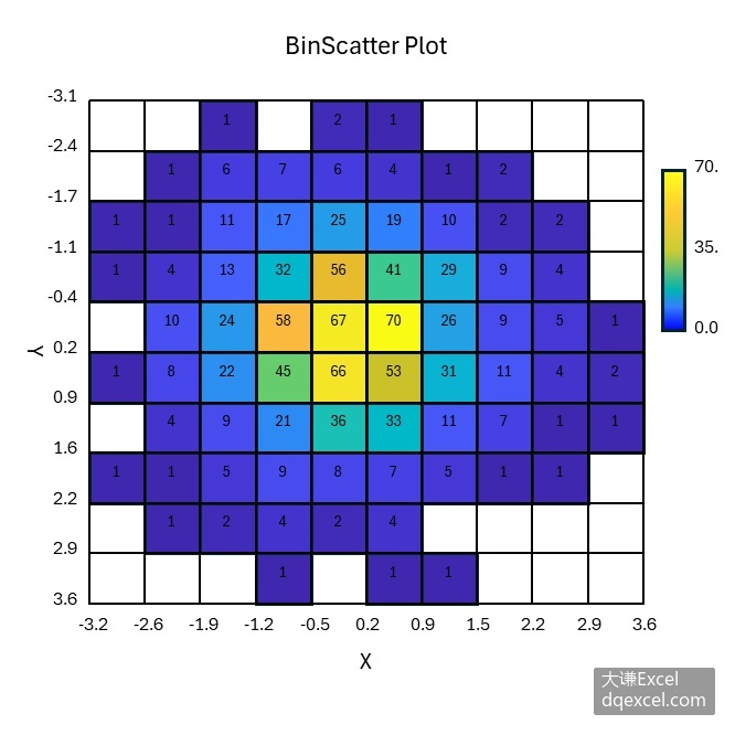
图4-9 给分箱散点图添加数据标签
用Python xlwings编程生成分箱散点图,首先需要按照4.1.3小节介绍的方法对二元数据进行分箱和频数分析,最后利用频数绘制热力图。完整代码见:Samples->ch07 数值型图表->04 分箱散点图->py.py。
import xlwings as xw #导入xlwings包
import os #导入OS包
def draw_bi_scatter(wb):
#绘制分箱散点图
sht=wb.sheets('plot')
shp=sht.api.Shapes.AddChart2() #创建空白图表
shp.Left=20 #图表位置和大小
shp.Top=20
shp.Width=420
shp.Height=400
cht=shp.Chart #获取图表
cht.ChartType=xw.constants.ChartType.xlXYScatter #图表类型为散点图
#清空序列
for i in range(cht.SeriesCollection().Count,0,-1):
cht.SeriesCollection(i).Delete()
ax1=cht.Axes(1) #获取横轴
ax2=cht.Axes(2) #获取纵轴
ax1.MinimumScale=-1 #横轴和纵轴取值范围
ax1.MaximumScale=11.3
ax2.MinimumScale=-1
ax2.MaximumScale=10
ax2.ReversePlotOrder=True #纵轴反转
#清空图形
if cht.Shapes.Count>0:
for i in range(cht.Shapes.Count,0,-1):
cht.Shapes(i).Delete()
#数据归一化
data2=[[0 for _ in range(10)] for _ in range(10)]
data3=[[0 for _ in range(10)] for _ in range(10)]
data=wb.sheets('plot').range('B2:K11').value
minv=1000
maxv=-1000
for i in range(10):
for j in range(10):
if minv>data[i][j]: minv=data[i][j]
if maxv<data[i][j]: maxv=data[i][j]
difv=maxv-minv
for i in range(10):
for j in range(10):
data2[i][j]=(data[i][j]-minv)/difv
for i in range(10):
for j in range(10):
data3[i][j]=data2[9-i][j]
#导入颜色查找表
cm=wb.sheets('colormap').range('A1:C256').value
#画网格
for i in range(11):
for j in range(11):
sx1=shape_x(cht,i)
sy1=shape_y(cht,0)
sx2=shape_x(cht,i)
sy2=shape_y(cht,j)
shp1=cht.Shapes.AddLine(sx1,sy1,sx2,sy2)
shp1.Line.ForeColor.RGB=xw.utils.rgb_to_int((200,200,200))
shp1.Line.Weight=1
sx1=shape_x(cht,0)
sy1=shape_y(cht,j)
sx2=shape_x(cht,i)
sy2=shape_y(cht,j)
shp2=cht.Shapes.AddLine(sx1,sy1,sx2,sy2)
shp2.Line.ForeColor.RGB=xw.utils.rgb_to_int((200,200,200))
shp2.Line.Weight=1
#用颜色填充网格
for i in range(10):
for j in range(9,-1,-1):
w=data3[i][j]
count=int(w*255) #该序号对应的颜色查找表中的颜色
if w-0>0.00000001:
if count>255:
r=int(cm[255][0])
g=int(cm[255][1])
b=int(cm[255][2])
else:
r=int(cm[count][0])
g=int(cm[count][1])
b=int(cm[count][2])
lf=shape_x(cht,i)
tp=shape_y(cht,j+1)
wd=cht.PlotArea.InsideWidth/(cht.Axes(1).MaximumScale-\
cht.Axes(1).MinimumScale)*1
ht=cht.PlotArea.InsideHeight/(cht.Axes(2).MaximumScale-\
cht.Axes(2).MinimumScale)*1
shp3=cht.Shapes.AddShape(1,lf,tp,wd,ht) #画矩形
shp3.Fill.ForeColor.RGB=xw.utils.rgb_to_int((r,g,b))
#画色条
lf=shape_x(cht,10.5)
tp=shape_y(cht,9)
wd=cht.PlotArea.InsideWidth/(cht.Axes(1).MaximumScale-cht.Axes(1).MinimumScale) * 0.4
ht=cht.PlotArea.InsideHeight/(cht.Axes(2).MaximumScale-cht.Axes(2).MinimumScale) * 3
shp4=cht.Shapes.AddShape(1,lf,tp,wd,ht) #画矩形
shp4.Fill.ForeColor.RGB=xw.utils.rgb_to_int((255,255,26)) #垂向多色渐变填充
shp4.Fill.OneColorGradient(1,1,1)
shp4.Fill.GradientStops.Insert(xw.utils.rgb_to_int((255,204,51)),0.25)
shp4.Fill.GradientStops.Delete(2)
shp4.Fill.GradientStops.Insert(xw.utils.rgb_to_int((204,204,51)),0.5)
shp4.Fill.GradientStops.Insert(xw.utils.rgb_to_int((0,179,179)),0.75)
shp4.Fill.GradientStops.Insert(xw.utils.rgb_to_int((51,128,255)),0.85)
shp4.Fill.GradientStops.Insert(xw.utils.rgb_to_int((0,0,255)),1)
#给色条添加标签
label_pos=[0 for _ in range(3)]
labels=[0 for _ in range(3)]
label_pos[0]=9.2
label_pos[1]=7.9
label_pos[2]=6.3
labels[0]=maxv
labels[1]=(maxv+minv)/2
labels[2]=minv
for i in range(3):
lf=shape_x(cht,10.9)
tp=shape_y(cht,label_pos[i])
wd=cht.PlotArea.InsideWidth/(cht.Axes(1).MaximumScale-cht.Axes(1).MinimumScale)*0.9
ht=cht.PlotArea.InsideHeight/(cht.Axes(2).MaximumScale-cht.Axes(2).MinimumScale)*0.6
shp5=cht.Shapes.AddLabel(1,lf,tp,wd,ht) #添加标签
shp5.TextFrame2.TextRange.Characters.Text=labels[i]
shp5.TextFrame2.TextRange.Characters.Font.Size=8
#shp5.TextFrame2.AutoSize= msoAutoSizeTextToFitShape
#绘制刻度标签-纵坐标
ylabel_pos=[0 for _ in range(10)]
ylabels=[0 for _ in range(10)]
for i in range(10):
ylabel_pos[i]=9-i
for i in range(10):
ylabels[i]=str(i+1)
for i in range(10):
lf=shape_x(cht,-0.6)
tp=shape_y(cht,ylabel_pos[i]+1- 0.2)
wd=cht.PlotArea.InsideWidth/(cht.Axes(1).MaximumScale-cht.Axes(1).MinimumScale)*1.5
ht=cht.PlotArea.InsideHeight/(cht.Axes(2).MaximumScale-cht.Axes(2).MinimumScale)*0.4
shp6=cht.Shapes.AddLabel(1,lf,tp,wd,ht)
shp6.TextFrame2.TextRange.Characters.Text=ylabels[i]
shp6.TextFrame2.TextRange.Characters.Font.Size=8
#shp6.TextFrame2.AutoSize=msoAutoSizeTextToFitShape
#绘制刻度标签-横坐标
xlabel_pos=[0 for _ in range(10)]
xlabels=[0 for _ in range(10)]
for i in range(10):
xlabel_pos[i]=i
for i in range(10):
xlabels[i]=str(i+1)
for i in range(10):
lf=shape_x(cht,xlabel_pos[i]+0.2)
tp=shape_y(cht,-0.07)
wd=cht.PlotArea.InsideWidth/(cht.Axes(1).MaximumScale-cht.Axes(1).MinimumScale)*1.5
ht=cht.PlotArea.InsideHeight/(cht.Axes(2).MaximumScale-cht.Axes(2).MinimumScale)*0.4
shp7=cht.Shapes.AddLabel(1,lf,tp,wd,ht)
shp7.TextFrame2.TextRange.Characters.Text=xlabels[i]
shp7.TextFrame2.TextRange.Characters.Font.Size=8
#shp7.TextFrame2.AutoSize=msoAutoSizeTextToFitShape
#绘制横坐标标题
lf=shape_x(cht,4)
tp=shape_y(cht,-0.5)
wd=cht.PlotArea.InsideWidth/(cht.Axes(1).MaximumScale-cht.Axes(1).MinimumScale)*2.5
ht=cht.PlotArea.InsideHeight/(cht.Axes(2).MaximumScale-cht.Axes(2).MinimumScale)*0.6
shp8=cht.Shapes.AddLabel(1,lf,tp,wd,ht)
shp8.TextFrame2.TextRange.Characters.Text='X Axis Label'
shp8.TextFrame2.TextRange.Characters.Font.Size=10
#shp8.TextFrame2.AutoSize=msoAutoSizeTextToFitShape
#绘制纵坐标标题
lf=shape_x(cht,-1.2)
tp=shape_y(cht,6)
wd=cht.PlotArea.InsideWidth/(cht.Axes(1).MaximumScale-cht.Axes(1).MinimumScale)*0.6
ht=cht.PlotArea.InsideHeight/(cht.Axes(2).MaximumScale-cht.Axes(2).MinimumScale)*2.5
shp9=cht.Shapes.AddLabel(2,lf,tp,wd,ht)
shp9.TextFrame2.TextRange.Characters.Text='Y Axis Label'
shp9.TextFrame2.TextRange.Characters.Font.Size=10
#shp9.TextFrame2.AutoSize=msoAutoSizeTextToFitShape
return cht
root=os.getcwd() #获取当前工作路径
app=xw.App(visible=True,add_book=False) #创建Excel应用
wb=app.books.open(root+r'/data.xlsx',read_only=False) #打开数据文件返回工作簿对象
sht=wb.sheets('Sheet1') #获取指定工作表对象
x=sht.range('A1:A1000').value #获取数据
y=sht.range('B1:B1000').value
#频数分析,同二元直方图代码
bx=10
by=10
minx=9999
maxx=-9999
miny=9999
maxy=-9999
for i in range(1000):
if minx>x[i]: minx=x[i]
if maxx<x[i]: maxx=x[i]
if miny>y[i]: miny=y[i]
if maxy<y[i]: maxy=y[i]
difx=maxx-minx
dify=maxy-miny
stepx=difx/bx
stepy=dify/by
count=[[0 for _ in range(10)] for _ in range(10)]
xi=[0 for _ in range(11)]
xi2=[0 for _ in range(11)]
xi[0]=minx
xi2[0]=minx+stepx/2
for i in range(1,11):
xi[i]=xi[i-1]+stepx
if i!=10:
xi2[i]=xi[i]+stepx/2
yi=[0 for _ in range(11)]
yi2=[0 for _ in range(11)]
yi[0]=miny
yi2[0]=miny+stepy/2
for i in range(1,11):
yi[i]=yi[i-1]+stepy
if i!=10:
yi2[i]=yi[i]+stepy/2
for k in range(1000):
for i in range(10):
if x[k]>=xi[i] and x[k]<xi[i+1]:
for j in range(10):
if y[k]>=yi[j] and y[k]<yi[j+1]:
count[i][j]+=1
#输出频数到sheet2
sht2=wb.sheets.add()
sht2.name='plot'
for i in range(1,11):
for j in range(1,11):
sht2.api.Cells(i+1,j+1).Value=count[i-1][j-1]
#根据频数绘制分箱散点图
cht=draw_bi_scatter(wb)运行代码生成类似图4-8的分箱散点图。